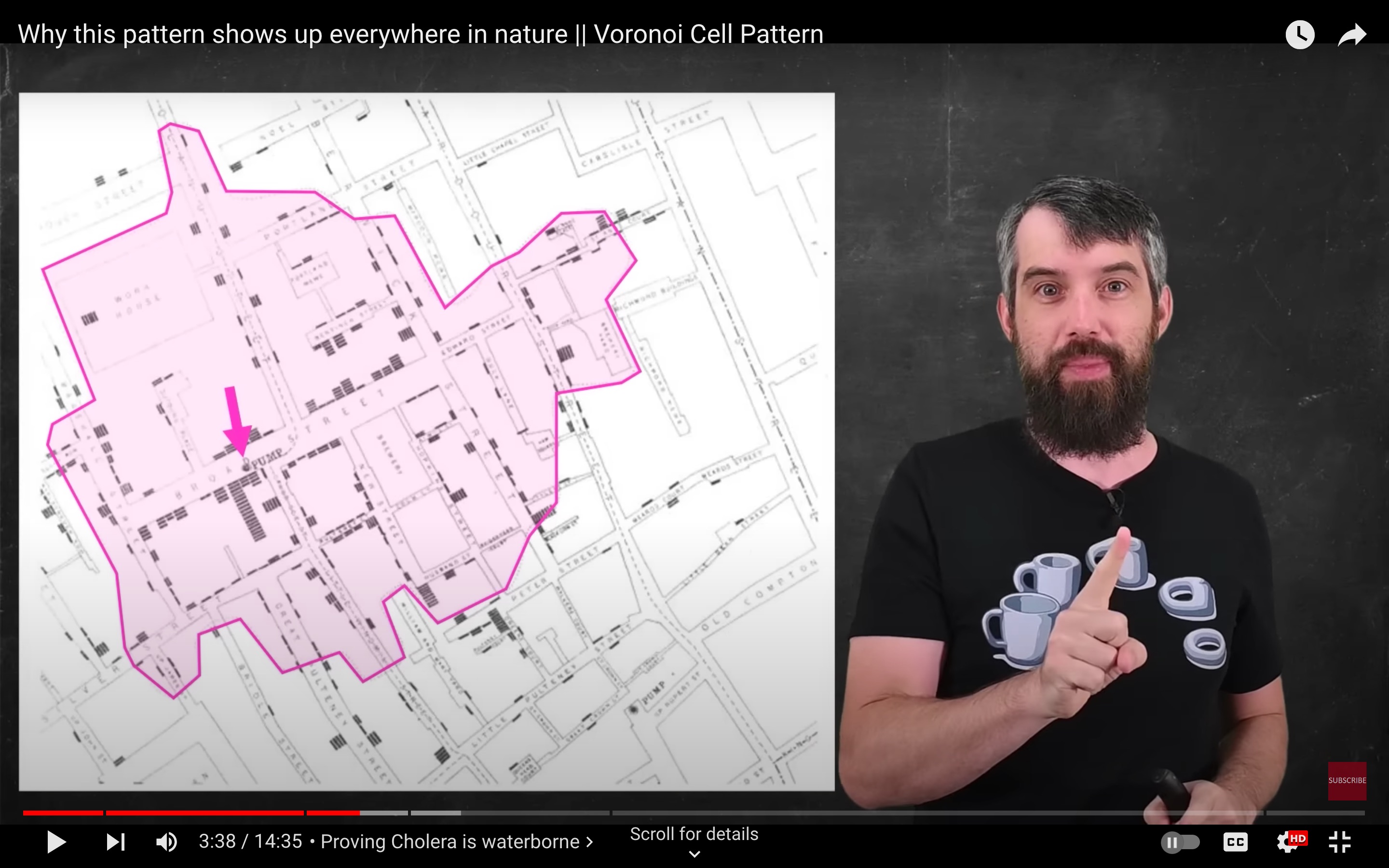
After about 03:03 in Dr. Trefor Bazett's June 2023 video Why this pattern shows up everywhere in nature || Voronoi Cell Pattern there is a discussion of a diagram representing work by John Snow
John Snow (15 March 1813 – 16 June 1858) was an English physician and a leader in the development of anaesthesia and medical hygiene. He is considered one of the founders of modern epidemiology, in part because of his work in tracing the source of a cholera outbreak in Soho, London, in 1854, which he curtailed by removing the handle of a water pump. Snow's findings inspired the adoption of anaesthesia as well as fundamental changes in the water and waste systems of London, which led to similar changes in other cities, and a significant improvement in general public health around the world.
Bazett uses the story of Snow's analysis as one example of the utility of Voronoi diagrams
The screenshot above shows an irregular polygon with roughly 40 sides and has about a half-dozen concavities - not typical for diagrams I've seen and made the polygons have in the ballpark of 3 to 6 sides and are always convex.
Of course the 2D Voronoi diagrams I look at and make are based on line-of-sight distances:
$$r_{ij}=\sqrt{(x_i-x_j)^2 + (y_i-y_j)^2}$$
and that's not how people walk.
So I'd like to ask:
Question Why doesn't John Snow's Voronoi diagram look like one? How was the diagram made? (distance to cholera-spreading water pump in 19th century London)
From the video:
Proving Cholera is waterborne one one of the most infamous examples of use cells to actually solve something occurred in the 1850s when there was a cholera epidemic in London and Jon Snow a physician in London not Game of Thrones discovered something kind of interesting. He noticed that there was a water pump on the map and in fact there were many water pumps in London, but when you try to map out which water pump is closest well he came up with a map that looks something like this.
This region was the portion of London that was all closest to this one pump, and then you'll notice in the map there's there's all these stacked lines those stack lines represented deaths to cholera and you'll notice how those are largely constrained within that geographic area. And so Jon Snow used this evidence to help support the theory that cholera was a waterborne transmission. And in effect this is a type of Voronoi cell. It's this particular cell that has the majority of these cholera outbreaks and because it's associated with a single water source then that's good evidence that cholera is waterborne - another great application...

